Imagine walking into a room—what do you feel? Is it the cozy warmth of a sunlit nook, or perhaps the cool calm of a serene blue space? Colors, those unapologetic invitations to our emotions, whisper to us in ways words cannot. They shape our experiences, breathe life into our environments, and, believe it or not, play a pivotal role in how we navigate the world. In this exploration of color psychology within interior design, we’ll unravel the kaleidoscope of hues and tones that transform mere walls into narratives of comfort, energy, or tranquility. So, grab that cozy cup of coffee, and let’s dive into this vibrant world together, shall we?
Unraveling the Kaleidoscope: How Colors Shape Our Spaces
Have you ever stepped into a room painted in a soft, buttery yellow? It’s as if the sun has spilled its warmth inside, wrapping around you like the most tender embrace. This is no accident. The choices we make in color aren’t just about aesthetics; they tap directly into the core of our emotional being.
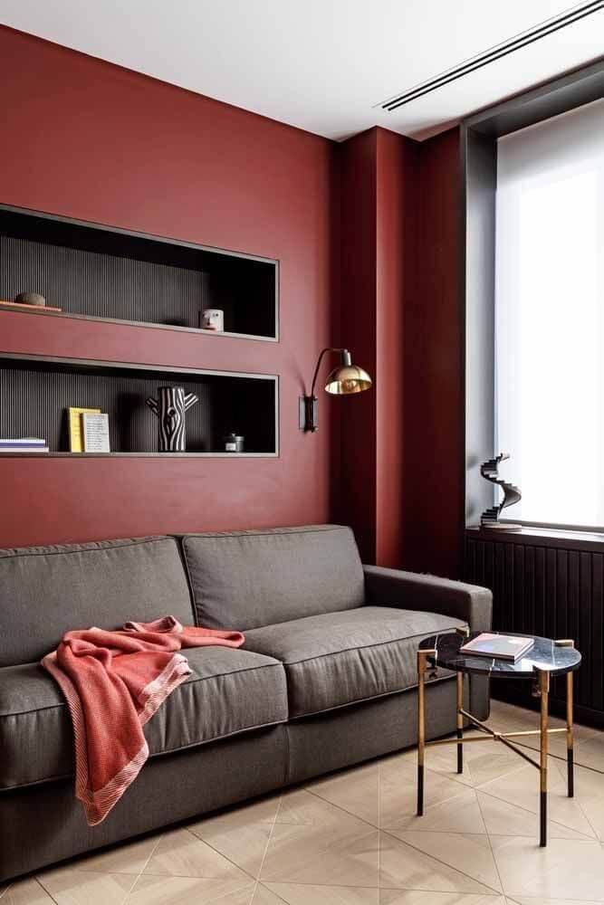
Think about it—red, with its bold intensity, ignites passion and energy, a perfect companion for spaces that thrive on creativity. Whether it’s a bustling kitchen where meals are made with love or an art studio buzzing with imagination, red pulls us in, urging us to act, to feel.
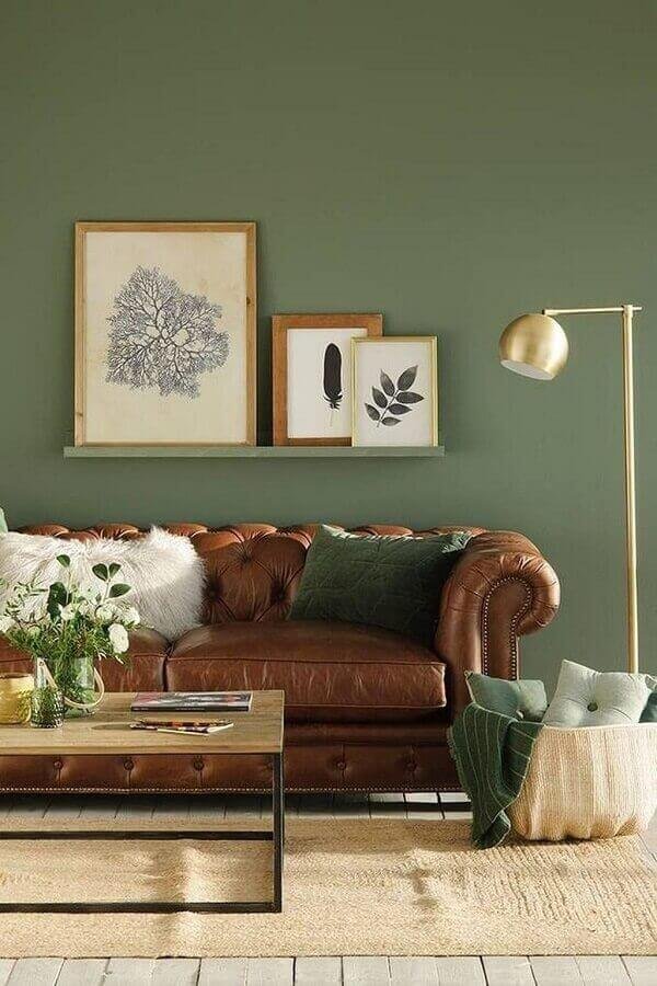
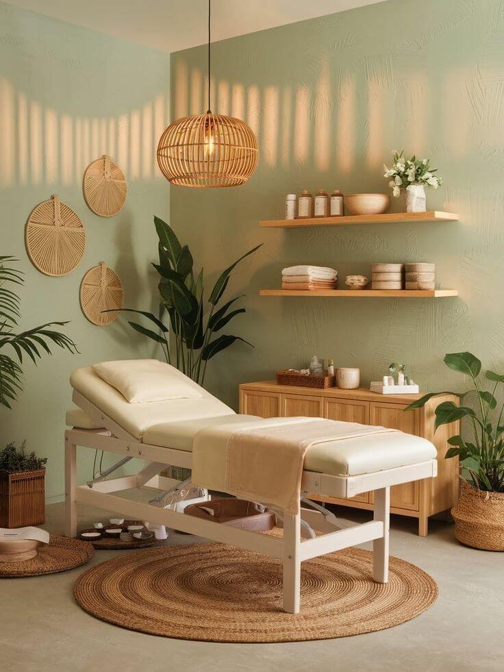
Now, picture a lush green wall. Instantly, you might find your breath slowing, your worries fading. Green, the color of nature, offers a soothing balm for the soul. It’s no surprise it’s often found in spaces designed for relaxation, be it a tranquil bedroom or a serene reading nook. This connection to nature is a reminder that we are, at our core, part of something much bigger, something alive and breathing.
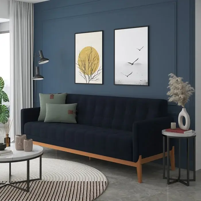
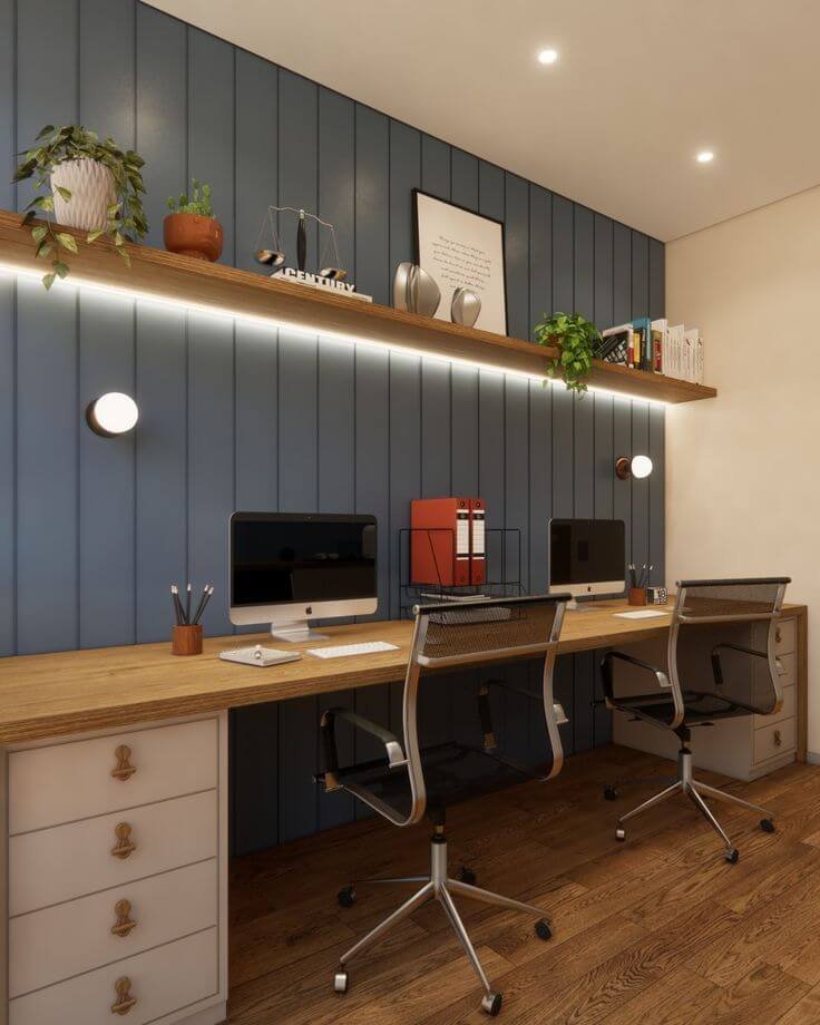
But what about the cool blues and purples? Ah, the calm of an evening sky captured in paint. Blues evoke tranquility, promoting peace and relaxation—ideal for a home office or a cozy corner where thoughts can flow freely. Meanwhile, deep purples can bring a touch of luxury and mystery, transforming a simple dining room into a theatrical experience, where every meal feels like an event.
As we navigate through the palette, let’s not forget the transformative power of neutrals—they are the unsung heroes in the world of design. Whites, grays, and soft beiges create a canvas, a backdrop that lets your personality shine through. They invite other colors to dance, to play, while holding the space together.
Colors, you see, are not just pigments on a palette; they are storytellers, shaping our experiences and moods. Each hue we choose sends ripples into our lives, crafting spaces that reflect who we are and how we wish to feel.
Beyond Aesthetics: The Hidden Psychology of Color in Design
Now that we’ve dipped our toes into the vibrant waters of color, let’s delve deeper into the psychological undercurrents that guide our intuitions and choices. It’s a dance between feelings and function, a delicate balance that often goes unnoticed until we pause to reflect.
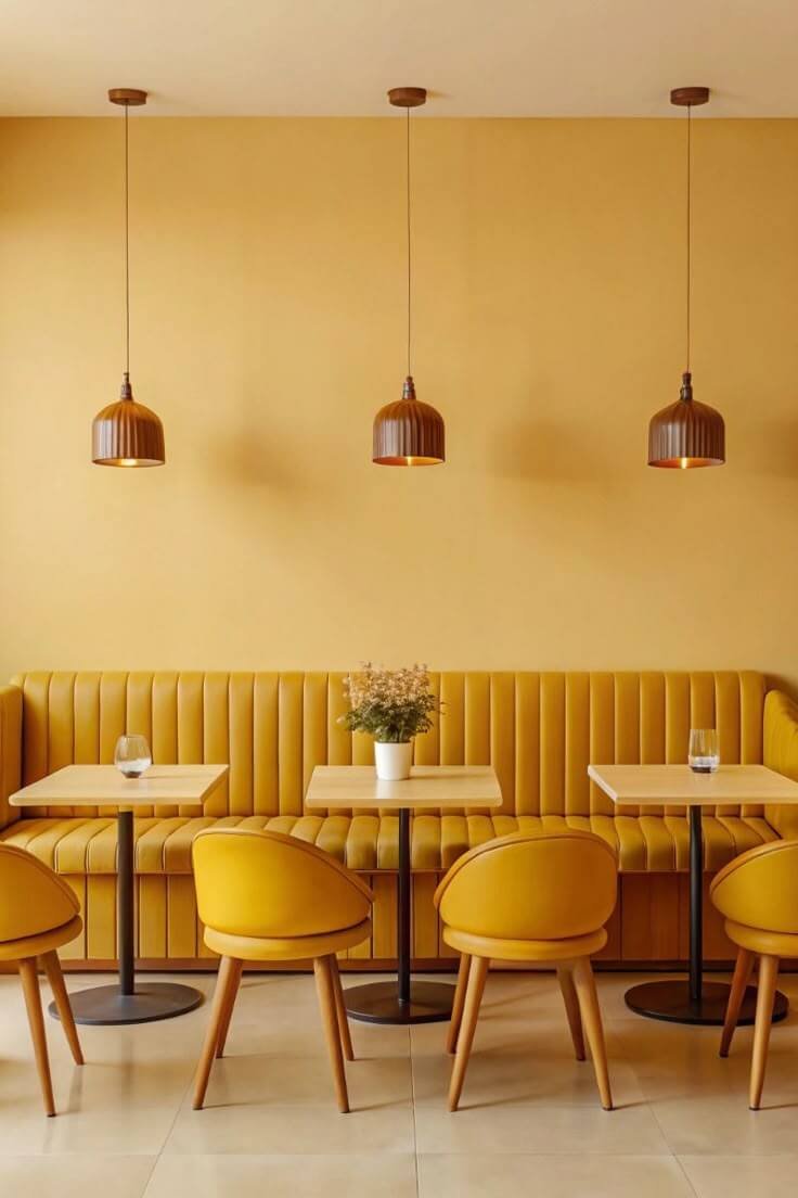
Imagine you walk into a brightly colored café, the walls adorned with vivid oranges and yellows. You feel a rush of energy; the chatter feels electric, the laughter contagious. This isn’t just ambiance; it’s the psychology of color at work. Warm colors stimulate, inspire social interaction, and elevate our mood. But too much warmth can lead to overstimulation. It’s a fine line, isn’t it?
Conversely, consider a spa decorated in soft blues and greens. The atmosphere invites you to unwind, to breathe deeply and let go. These cooler shades communicate tranquility and calm, pulling us back from the chaos of the outside world. They remind us of the vast expanse of sky and water, invoking feelings of serenity and restoration.
But here’s where it gets intriguing. The psychology of color goes beyond individual preferences; it dives into cultural meanings and personal experiences. For instance, in Western cultures, white often symbolizes purity and new beginnings, while in some Eastern cultures, it is a color of mourning. Understanding these nuances helps designers create spaces that resonate not only on an emotional level but also on a cultural one.
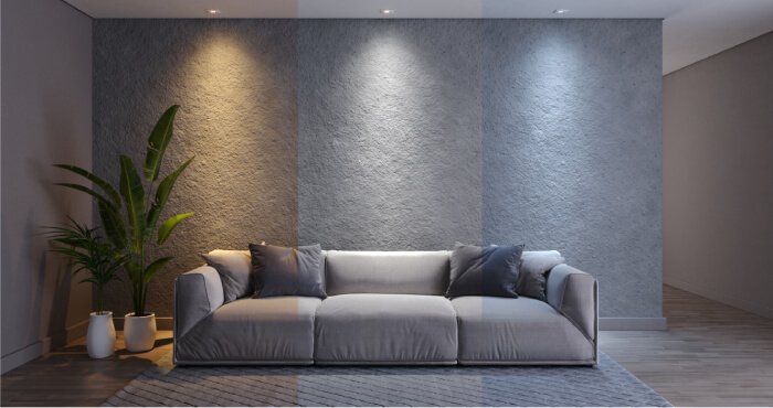
Let’s not forget the role of lighting in this poetic interplay. A soft, warm light can transform a stark white wall from clinical to cozy, while harsh fluorescent lights can drain the vibrancy from even the most lively hues. So, as you ponder your palette, consider how light dances across colors, how it transforms and reveals the emotional layers beneath.
In the end, the science of color psychology in interior design is like a carefully composed symphony, each note carefully selected to evoke a particular feeling or response. It’s a reminder that our spaces are more than just structures; they are reflections of our inner world, inviting us to experience life in all its colorful beauty.
As we sip the last of our coffee and contemplate the myriad colors that surround us, remember this: every shade has a story to tell, and every room has the potential to become a canvas of emotions. The next time you step into a space, take a moment. What do you feel? What stories do the colors whisper to you? Embrace the journey of color psychology in your own design choices, and let your spaces resonate with your unique melody. After all, life is too short for dull walls and uninspired corners—let color be your guide, illuminating your path in this vast tapestry of existence.
